Yield Curve: What It Is, How It Works, and Types, Meet the Answer.
The Yield curveis a foundational concept in fixed-income investing and macroeconomic analysis. At its core, it is a graphical representation of the interest rates (yields) on debt instruments—typically U.S. Treasury securities—plotted against their time to maturity. In simple terms, it shows how much the government must pay to borrow money for 1 month versus 10 or 30 years. Investors, economists, and central banks closely monitor it because its shape can signal economic growth, inflation expectations, and potential recessions.
🔍 What Is a Yield Curve?
It visualizes the relationship between bond yields and their maturities. While most commonly constructed using U.S. Treasury securities (bills, notes, and bonds), yield curves can be built for corporate debt, municipal bonds, or even swap rates.
Key components:
X-axis: Time to maturity (e.g., 3 months, 2 years, 10 years, 30 years)
Y-axis: Yield (annualized return, expressed as %)
Data source: Market prices of actively traded government securities (real-time and risk-free)
Because Treasuries are backed by the full faith of the U.S. government, their yields serve as the risk-free rate—a benchmark for pricing all other assets.
📊 Example: If the 2-year Treasury yields 4.2% and the 10-year yields 3.8%, the curve is inverted—a historically rare and significant signal.
⚙️ How Does the it Work?
It doesn’t just reflect current rates—it encodes market expectations about future interest rates, inflation, and economic activity. Three core theories explain its behavior:
- Expectations Theory
Long-term yields reflect the market’s average expectation of future short-term rates. If investors expect the Fed to cut rates next year, long-term yields drop today.
- Liquidity Preference Theory
Investors demand a term premium for holding longer-term bonds (which carry more interest rate and inflation risk). Thus, even in stable times, it usually slopes upward.
- Market Segmentation Theory
Supply and demand in specific maturity segments (e.g., pension funds buying 30-year bonds) can distort parts of the curve independently.
Central banks—especially the Federal Reserve—influence the curve directly via:
Short-end: Setting the federal funds rate
Long-end: Quantitative easing (QE) or quantitative tightening (QT)
“Operation Twist”: Selling short-term and buying long-term Treasuries to flatten the curve
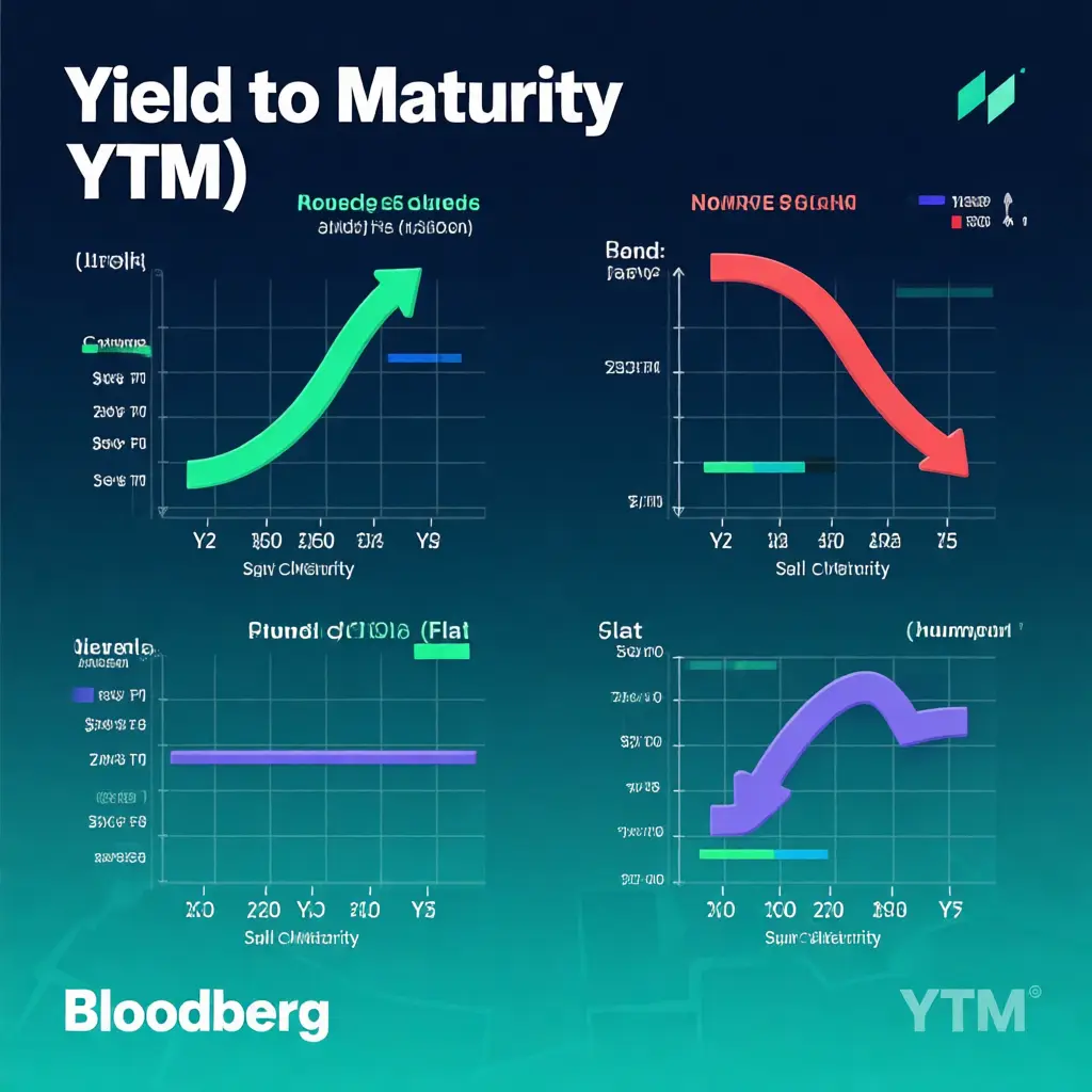
📉 4 Types of Yield Curve (With Real-World Context)
It appears in different shapes carries powerful economic signals. Here are the four primary types—and what they mean for your portfolio.
🟢 Normal (Upward-Sloping):
Shape: Short-term yields < long-term yields
Why it happens: Investors demand higher returns for locking up capital longer (term premium).
Economic signal: Healthy growth, moderate inflation, confidence in future expansion.
Historical context: Seen in ~70% of market history (e.g., 2017–2019).
🔴 Inverted Yield Curve:
Shape: Short-term yields > long-term yields (e.g., 2-year > 10-year)
Why it happens: Markets anticipate Fed rate cuts due to slowing growth or recession risk.
Economic signal: Strong recession predictor—the 2s10s (2-year/10-year) spread has inverted before every U.S. recession since 1955.
Recent example: 2022–2023 inversion preceded banking stress (SVB collapse) and soft landing concerns.
⚪ Flat Yield Curve:
Shape: Yields similar across maturities
Why it happens: Transition phase—often between normal and inverted (or vice versa).
Economic signal: Uncertainty. The Fed may be pausing rate hikes amid mixed data.
Investor action: Favor intermediate-term bonds (e.g., 3–5 year) for balance.
🔵 Humped (or Bell-Shaped):
Shape: Medium-term yields > short- and long-term yields
Why it happens: Expectations of near-term tightening followed by longer-term easing.
Economic signal: Transitory policy shift—less common, but observed in 2006 and early 2024.
Portfolio implication: Barbell strategy (short + long duration) may outperform.
💡 Why the Yield Curve Matters to You?
Even if you don’t trade bonds, the yield curve impacts:
Mortgage rates (10-year Treasury is a key driver of 30-year fixed loans)
Savings accounts & CDs (banks adjust rates based on the curve)
Stock valuations (discount rates for future cash flows rise when long yields climb)
Recession risk (inversions often precede equity drawdowns by 6–18 months)
Smart investors use the yield curve as a macro compass—not a timing tool, but a risk-awareness framework.
📚 Key Takeaways:
A yield curve plots yields vs. maturities—most often using U.S. Treasuries.
Its shape (normal, inverted, flat, humped) reflects market expectations for growth, inflation, and Fed policy.
An inverted yield curve is a historically reliable recession warning—but timing remains uncertain.
Monitor the 2-year/10-year spread—it’s the most watched indicator by economists and the Fed.
Never trade solely on the curve—but always consider it in your asset allocation.
🔗 Further Reading & Internal Linking Suggestions (For CMS Implementation)
How Rising Bond Yields Affect Your Stock Portfolio
Recession Indicators: Beyond the Yield Curve
Treasury Yield Calculator: Estimate Your Bond Returns
Federal Reserve Rate Decisions: What to Expect in 2026